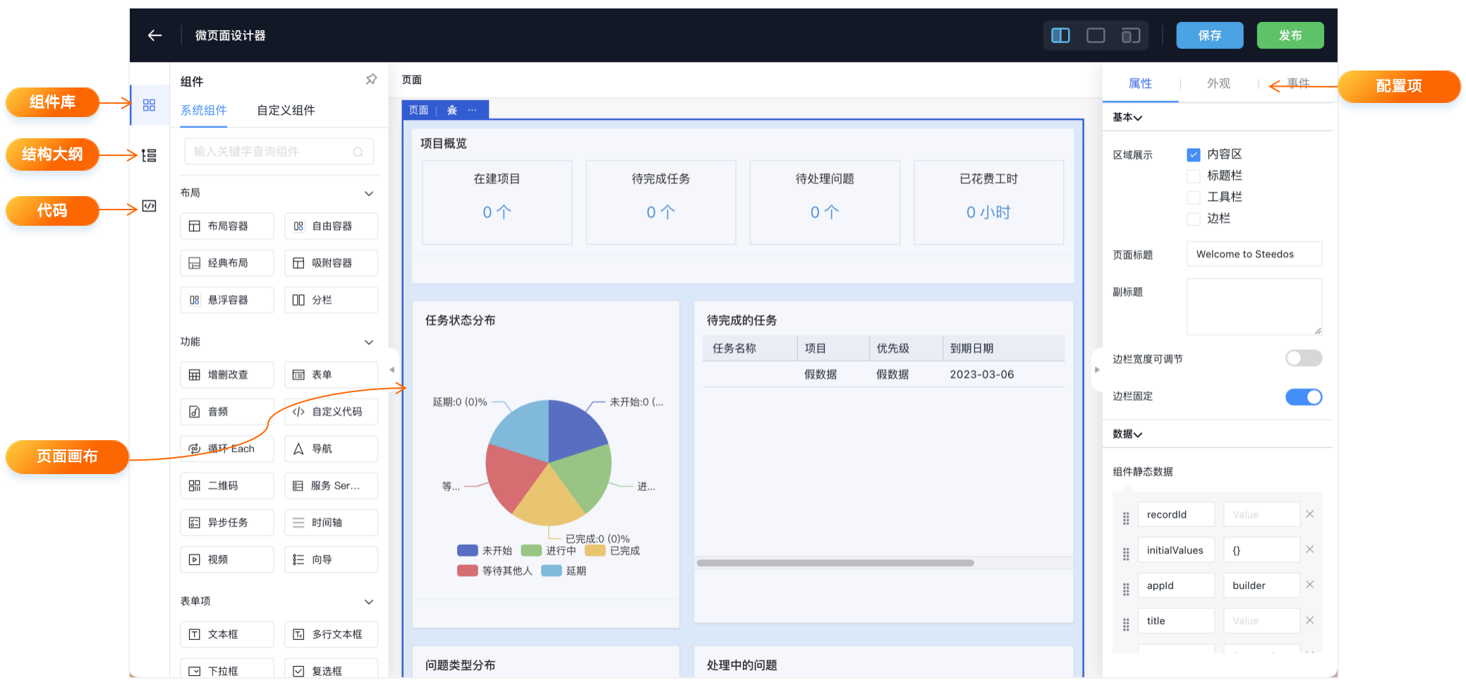
Micro Page Builder
The Micro Page Builder in the Steedos platform is a powerful interface that allows users to design and customize their application pages using a drag-and-drop approach.
In the integrated designer of Hengyi Magic Cube, users can utilize various component types, including:
- Native Components: Hengyi Magic Cube adapts native Baidu Amis standard components, allowing users to design and use them with control.
- Magic Cube Components: These are components standardized for Hengyi Magic Cube system pages, such as list views, object tables, related tables, and more. Compared to native components, Magic Cube components are easy to use with simple configuration.
- Custom Components: The Hengyi Magic Cube platform supports user-customized components. Once a component is successfully published, it can be used in the designer.
Creating a New Micro Page
To create a new Micro Page, follow these steps:
-
Access Micro Page Creation: Go to the "Settings" application, click on the "User Interface -> Micro Pages" menu on the left, and then click the "New" button in the upper right corner to start creating a new Micro Page.
-
API Name: Enter a unique API name that does not conflict with other Micro Pages.
-
Name: Provide a display name for the Micro Page.
-
Renderer: Select "Amis."
-
Status: Used to control whether the Micro Page is enabled.
-
Object: When the type is "Record Page," "List Page," or "Form," you need to choose the object to bind.
Creating Micro Pages of the "Form," "List Page," and "Record Page" types will automatically generate a pre-designed Page Version for users to further develop.
Designing the Page
After creating a Micro Page, you can open the Micro Page Builder to design the page:
-
Access the Designer: In the Steedos platform, navigate to the Micro Page you want to edit, and then select "Designer" to launch the designer.
-
Interface Layout: The page designer offers various layout options, allowing you to create and customize page layouts for different devices, such as desktop, tablet, or mobile.
-
Select Components: Using the sidebar, you can browse standard components (e.g., list views, chart reports, buttons, etc.) and custom components. Simply drag and drop these components into designated areas of the page layout.
-
Configure Components: Click on a component on the page, and then use the property panel for detailed configuration. You can set data sources, formats, and interaction behavior for the components.
-
Preview the Page: Use the preview options at the top of the page designer to see how the page appears on different devices and screen sizes, ensuring responsive design consistency.
-
Save and Test: After completing the page design, save your work and test it in a sandbox environment to ensure the new page functions as expected.
-
Publish the Page: Once testing is successful, you can publish the page to make it part of a specific application. During publishing, you can select the visibility of the page for users, such as only for administrators or specific role-based users.
Advanced Features of the Page Designer
-
Dynamic Display: Set rules to control when specific components should be displayed or hidden based on certain conditions, creating dynamic and interactive user experiences.
-
Custom Components: For users with specific requirements, you can create fully customized components using React.
-
Version Control: Use version control to manage different versions of the page and roll back to previous versions when needed.
-
Permission Settings: Adjust page layouts and available components based on user permissions to ensure that users only see information they are authorized to access.
Best Practices
-
User Experience First: Always consider the end user's experience when designing pages, ensuring that the layout is intuitive and easy to navigate.
-
Performance Considerations: Avoid using too many components on a single page, as this can impact page load times and performance.
-
Continuous Iteration: Regularly review and update page designs as business requirements change to maintain the relevance and effectiveness of your application.
Publishing the Page
After completing the page design, you need to click the "Publish" button in the upper right corner of the designer or on the Micro Page record details page to publish the designed page content. There is no difference between the two publish buttons.
It's important to note that every time you make changes in the designer, you need to click the publish button to make the latest design visible to end users.
The publishing operation essentially marks the current latest "Page Version" as "published," and the content visible to end users will be the latest version in the "published" state.
Displaying in the Application
Assuming that we have designed and published a Micro Page, here are the steps to bind a Micro Page of type "Application Page" to a tab and make it visible to end users:
- Go to the "Settings" application, click on the "User Interface -> Tabs" menu on the left, and then click the new button in the upper right corner to create a new tab.
- When creating a new tab, select "Page" as the "Type," and in the "Page" property, choose the Micro Page you just published to bind it to the tab.
- Go to the "Applications -> Applications" menu on the left to create a new application or edit an existing one. In the application's tab properties, select the newly created tab.
- After refreshing the browser, click on the nine-grid icon in the upper left corner and enter the newly created application in the "Application Launcher" that pops up.
- At this point, you can see the newly created tab in the top navigation bar. Click on the tab to access the customized page designed using Amis.
Supported Custom Page Types
The Hengyi Magic Cube Micro Page Engine supports various types of page designs within the system, including:
- Application Pages: Brand new pages used to design enterprise business data dashboards, dashboard data pages, etc.
- Record Pages: Details pages for data records.
- List Pages: Object data list pages.
- Form Pages: Data creation and editing pages.
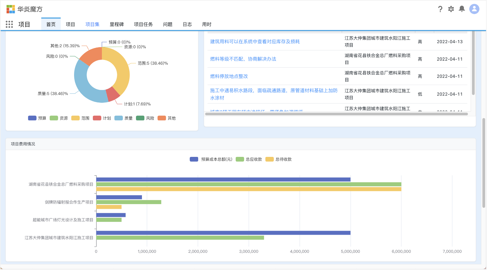
Application Pages
If you need to customize a brand new application page, you can use this type of Micro Page. It allows you to create a customized page designed using Amis for the system, and users can access this page through tabs.
For example, you might want to configure a homepage for a project application, displaying various project income, payment statistics curves or bar charts, and related list data.
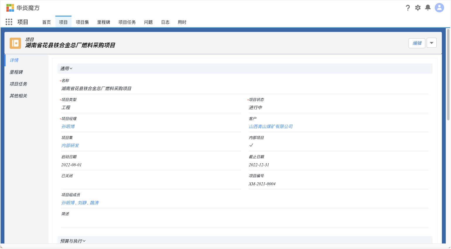
Record Pages
Sometimes, you may not need to customize an entirely new application page but wish to customize a specific business object, such as a record page for the contract object. This allows you to replace the system's built-in record page to achieve a personalized display of record details.
List Pages
Similar to record pages, "List Page" type Micro Pages are used to customize specific business objects, such as list pages for the contract object. This allows you to replace the system's built-in list pages to achieve a personalized list page